

by Carly Bornstein-Hayward
Should we judge a book by its cover? Might as well, it is too hard not to!
I find when scanning for a new or interesting book that what draws me in is the title. If the title sounds interesting or if it sounds like the type of book I enjoy I will look more closely (you can usually tell the genre from the title). I mean, how can I not pick up a book called Midnight in the Garden of Good and Evil? Only then, do I look at the cover. Does it have a good color scheme? Does it include a hot guy (preferably on a romance)? Basically, does it look like something I want to pick up?
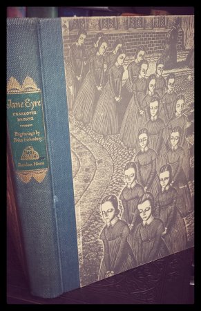
You can tell a lot about a book by its cover, for example the genre. The easiest thing to decipher is whether or not the book is a romance. Typically, there is a couple embracing, a woman in a state of undress, or a muscular guy with his shirt off (always a plus). Next you can tell the sub-genre, is it contemporary or historical? Just look at the clothes! Next is it paranormal or from a particular region? Are there cowboys, vampires or Scottish Lairds? All of this is easy to figure out. Fantasy books always have swords or something magical to them, science fiction stories are usually minimalist (or ragged if it is dystopian), thrillers have exotic places through a red filter, and mysteries have fog, lots of fog.
And yet, there is that indefinable quality that can draw us to a certain book. Perhaps you like that particular shade of green, or the way the person stares straight at you. Or maybe those are all things you hate! It is sad but true, a book can be read solely based on whether or not the cover happens to appeal to your sensibilities. If I happen to think the model on the cover looks “snobby” I am unlikely to pick up the book. It is completely possible that the actual character is the most endearingly sweet person in the world, but I don’t get that from the cover, so I don’t care.
Some people think e-books have de-emphasized the cover, but I think that is wrong. The first thing you look at when searching for an e-book is the cover. That can be a big problem with self-published books. If the author didn’t spend the money on getting the cover professionally (and well) done, it is obvious. The book looks cheap, and therefore, many make the assumption that it is poorly written. If effort isn't shown on the cover, it is easy to assume that effort wasn't put into the writing.
It is a sad but true state of affairs. Covers are important, they indicate what the reader is going to find within its pages. Whether the genre is sci-fi or romance, whether the story was self-published, you can find out based on the cover. Therefore, cover designers have become a necessary (and smart) expense when self-publishing.
What are some of your favorite covers? Do you like ones with characters or more simplistic ones? Feel free to share your favorites with me!